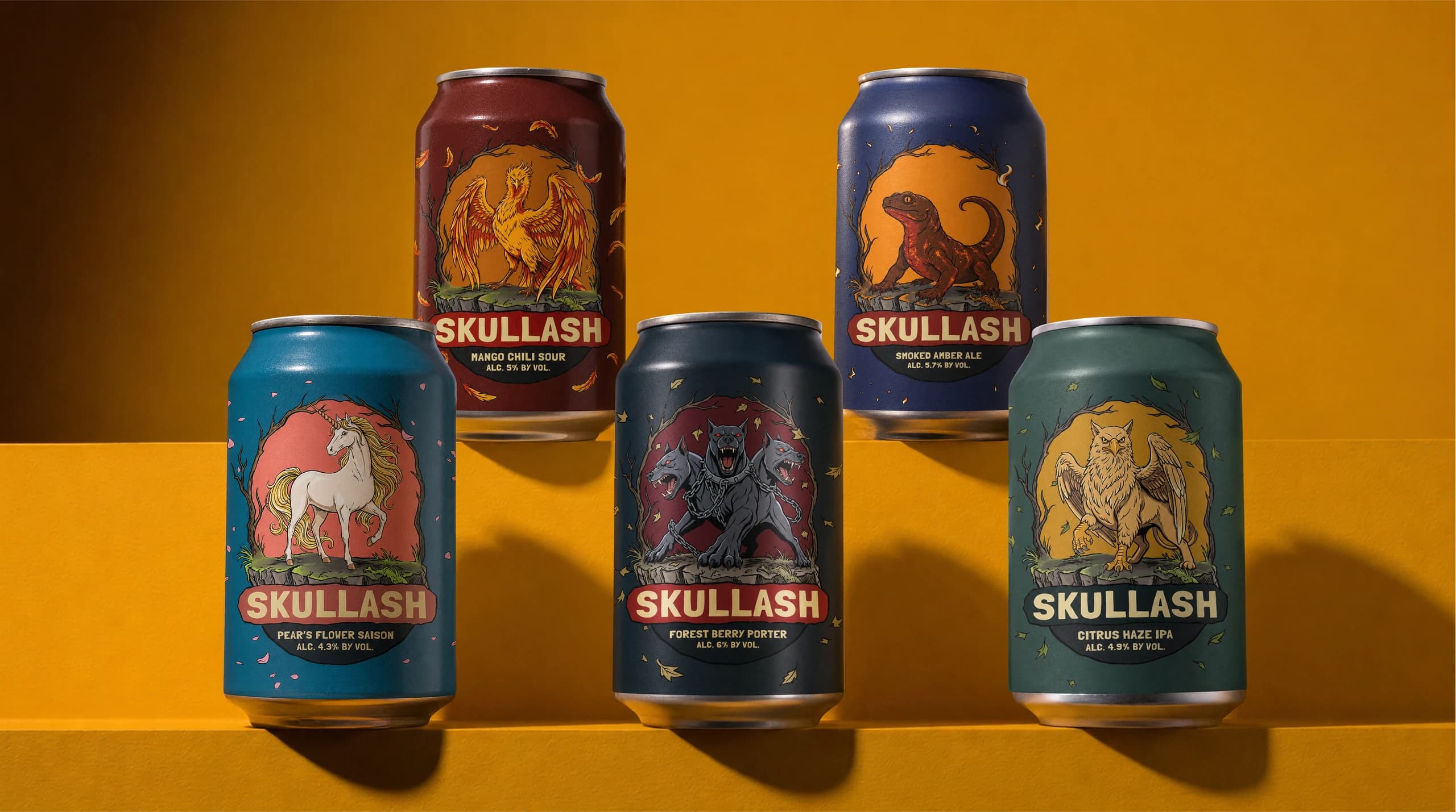
SKULLASH
Illustration • Branding • Packaging Design
SKULLASH is a craft line where the taste looks back at you before it ever hits your tongue. Each can is held by its own hand-drawn beast — its face, colour and temper are the drink inside.
Not a range with different numbers down the side, but one system wearing five faces. Each can carries its own mascot — its palette echoes the drink, its character lives out the taste. You don't pick by style, you pick by mood: “Choose — who are you today?”
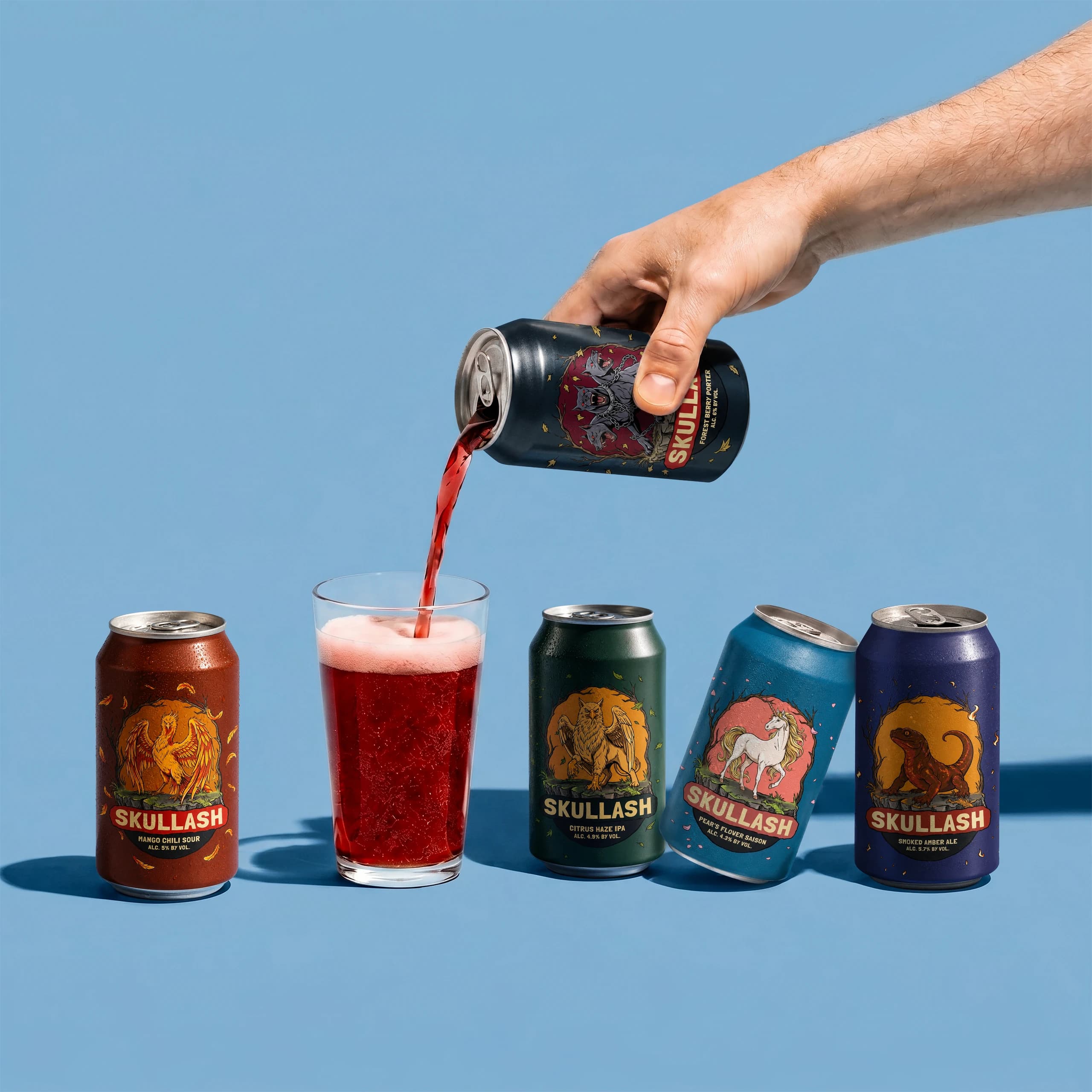
Five creatures, one per flavour. The mascot isn't decoration — it's the taste turned into a character. Phoenix — mango that burns off into pepper. Griffon — citrus through the hop haze. Unicorn — a rare pear bloom. Cerberus — a dark porter out of the deep woods. Salamander — smoke and amber.
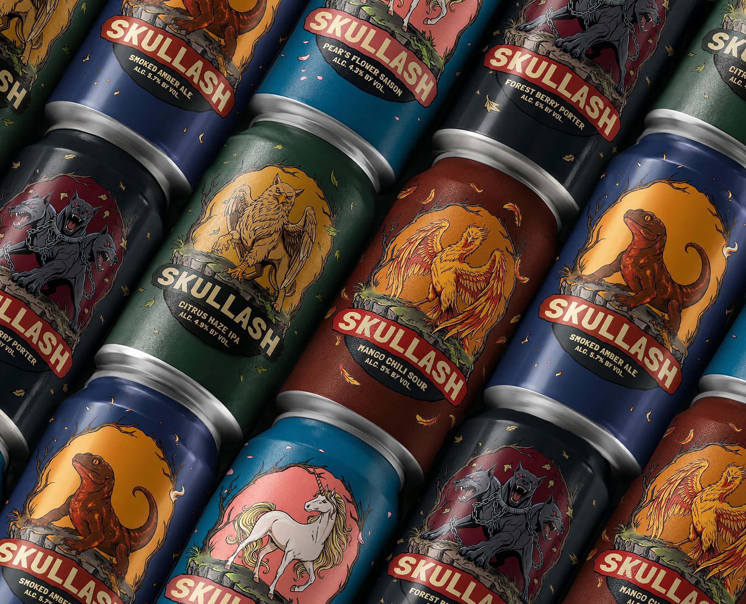
A thick black outline holds every beast — the way Saturday-morning cartoons were inked, frame by frame, all by hand. The colour is dimmed on purpose: not one clean, postcard tone — that soot in the paint is the vintage itself, the 70s–80s patina. Nib, hatch and flat fill, charged with the snap of a cheap two-colour gig poster run off-register. Loud, alive, a little reckless — and run as a system.
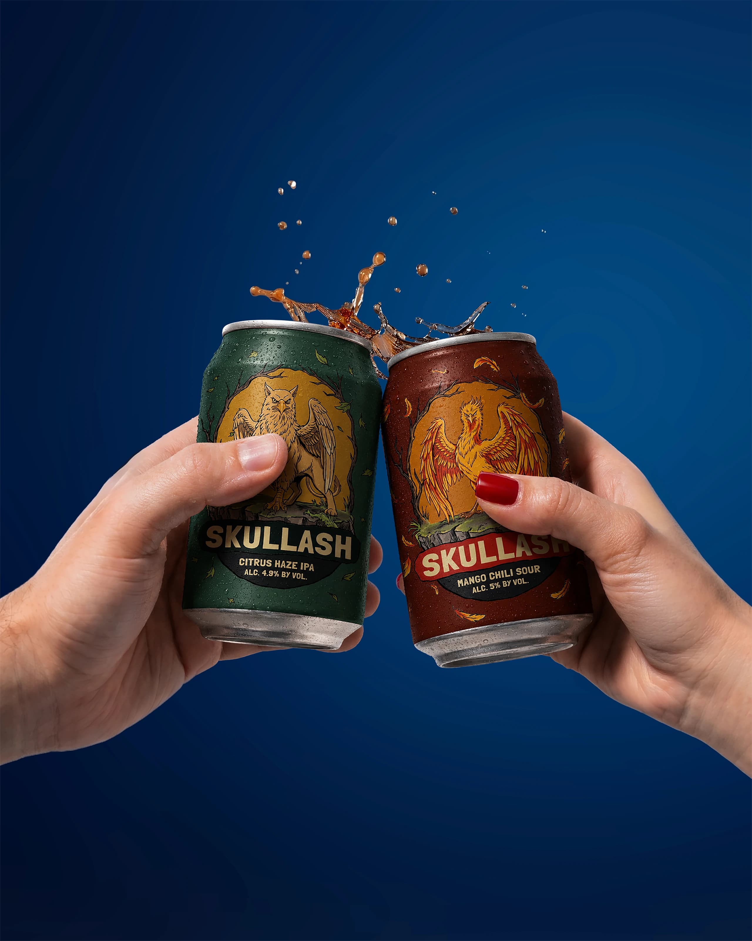
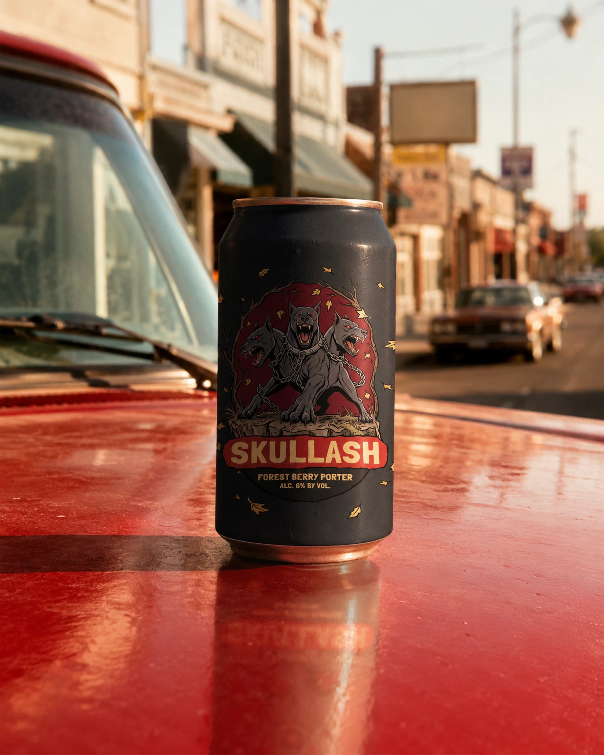
Now you choose the taste with your eyes. Want to burn down and rise again — take the Phoenix; drawn to warm smoke — the Salamander; after dark berry depth — the Cerberus. Five stand side by side and argue with character, not numbers.
We'll tell your flavour in a picture, before the first sip.